The print world has seriously become a graphic designer’s oyster.
As a designer three decades ago when I wanted to present my ideas for events, tenders, or proposals that included die cuts and special papers or surfaces, printing with a material other than the usual paper stocks was limiting, and it was very expensive.
But the mouse mats, mugs and event banner options soon began to appear, bringing demand for more sophisticated custom digital printing capabilities.
Today, you can print on almost any surface. This is why you’ll have to try really hard to prove the value of digitally reproduced artwork (or, worse still, reproduction glycee/archival prints as ‘limited editions’).
Anything from a digital printer shouldn’t be numbered (think of machine-made crockery and an antique handmade plate). Nothing comes close to the value of a handmade unique product. It’s a copy.
A newspaper publisher in Australia began to sell numbered reproductions of popular artists’ original works. It was alarming – especially when they didn’t use the word ‘reproduction’ in their description, ‘limited edition fine art prints’.
Theo and I instantly foresaw the scenario where a Queenscliff Gallery visitor would proudly tell us of their “fine art” purchase, only to have their mood dampened upon discovering that the valuable part of their acquisition was the white strip at the bottom of the poster where the artist applied the edition number and signature.
I do accept that people are really happy buying posters…
I own a poster from a Picasso exhibition that I love and purchased at a market in Paris. I have another of a Chagall exhibition purchased in Rome. But both are not numbered, didn’t cost hundreds of dollars or thousands, and sold to me as original works of art – they are prints of original artwork.
With this in mind, I sometimes struggle to value art made through digital technology – too purist?
And what of NFTs? That, another time!
But I can still enjoy digital benefits; technology helps with my limited capacity. It’s either that or I don’t get to play.
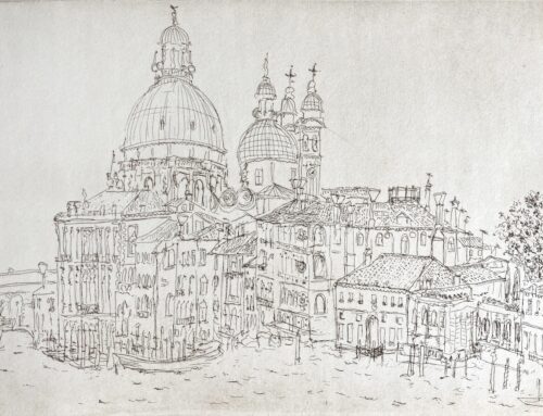
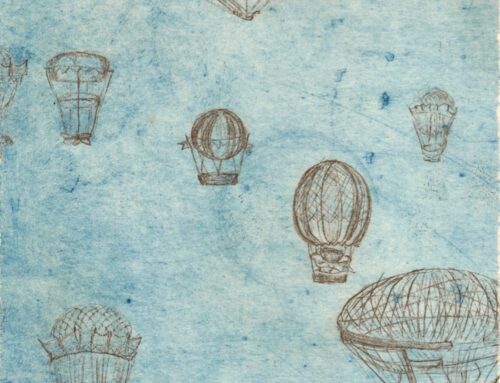
One such new experiment that I’ve loved is woodblock printing. Using my sketches from our recent Venice trip, I refined the characteristics of windows, facades and architecture in Illustrator. I sent them to a laser cutting service exploring ply and balsa woods.
I carefully created a file using my experience with setting up die cuts. I considered the negative space as this would be just as interesting and useful when printing as the shapes themselves.
View how I applied the window sketches and used the die-cut shapes to make the cards.
This whole process formed a great bridging time before I embarked on the Here and There body of work.
I had found a task to ease me into the Venice work. It was stimulating, inspiring, and fun; it melded my design and art love, and I could produce something sellable as a result.
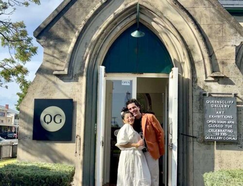
The two-colour woodblock print, Venice Windows and the unique handmade cards are now available at Queenscliff Gallery (cards only available in the gallery).
I believe the print and the cards are more valuable than digital reproductions, although made with a little help from digital technology.
I’m comfortable that my creativity and hand did most of the work.


")
")
")
")
")